
Hiya, I’m Mia, a graphic designer based in Georgia who blends cultural insight with fun, intentional design.

Gaudí is Barcelona

Seasons Calendar

Lily's Tea Coffee & Bread

Paw Bean

Lyric Video

Bauhaus Presentation

Thankful 4 America

Archive
thank you for your Interest
sadly this page is under construction :(
The Seasons Calendar


Overview
Seasons Calendar is a narrative-driven calendar that reimagines the year through personified illustrations of winter, spring, summer, and fall. Each quarter is represented by a character shaped by the literary and sociological meanings tied to its season, using illustration and design to reflect the shifting, transient nature of emotion over time.
A Closer Look


Designed as a layered stationery set, Seasons Calendar extends beyond a single booklet. The calendar is housed in a parchment envelope and finished with velvet ribbon accents, leading into thoughtfully matched accessories that introduce a playful, collectible element to the experience. From there, the project opens into additional elements such as a bookmark and a series of character cards.Each card features a short excerpt connected to its season, allowing the personalities of the characters to unfold gradually as the set is collected. Together, these elements encourage slower engagement, inviting the viewer to spend time with each illustration and uncover its meaning.Through illustration, storytelling, and design, Seasons Calendar encourages a slower pace, with each collected element adding to the broader story.
Lyric Video

Overview
This project reimagines Addison Rae’s song “Fame is a Gun” as a lyric video that reflects her bold and playful pop brand. Drawing inspiration from her fashion, iconography, and music and evoking modern pop icons, the video uses vibrant colors and balanced, expressive typography to mirror the energy and personality of the track.
Storyboarding
To capture Rae’s essence in lyrical format, a storyboard was developed visualizing a personality through colors and type coupled with pre-planned animation techniques such as panning shots and impact cuts that follow the rhythm of the hypnotic song.The deliberate utilization of this technique allowed for a well executed motion graphic that brings the qualities of Fame is a Gun to life.From, typography, composition, to color, each choice reflects the track’s bold yet harmonious tone while translating Addison Rae’s visual identity into a dynamic, engaging lyrical experience.


Ambient Background
Gaudí is Barcelona
Overview
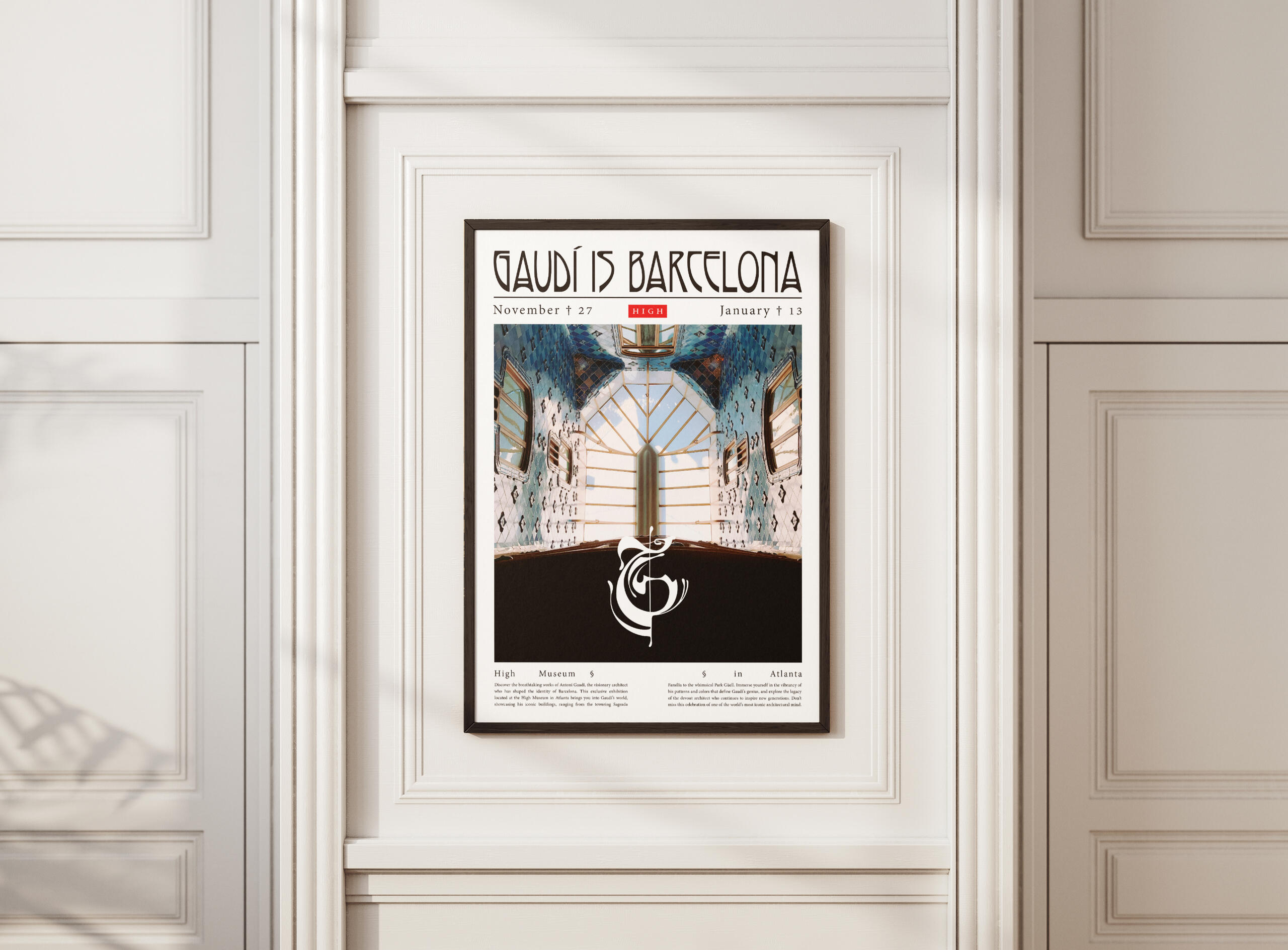
Gaudí in Barcelona is a conceptual exhibition held at the High Museum of Art in Atlanta, showcasing the life and work of Antoni Gaudí, a prominent Catalan architect most known for his work on the Basílica de la Sagrada Família. To showcase and inform museum goers of his work, the project entailed promotional materials such as a poster, pamphlet, and logo to market the exhibition.
Branding


Primary Branding Color

Secondary Branding Color
Tertiary Branding Color


A simple sleek color palette paired with a bespoke logo mark evoke Gaudí's naturalism with an Art Nouveau-inspired primary typeface and a soft serif copy font. In unison, these design choices center the exhibition's subject while being eye-catching.
Promotional Materials
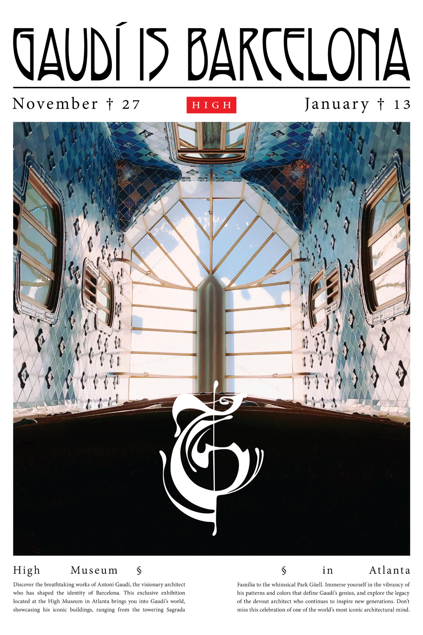
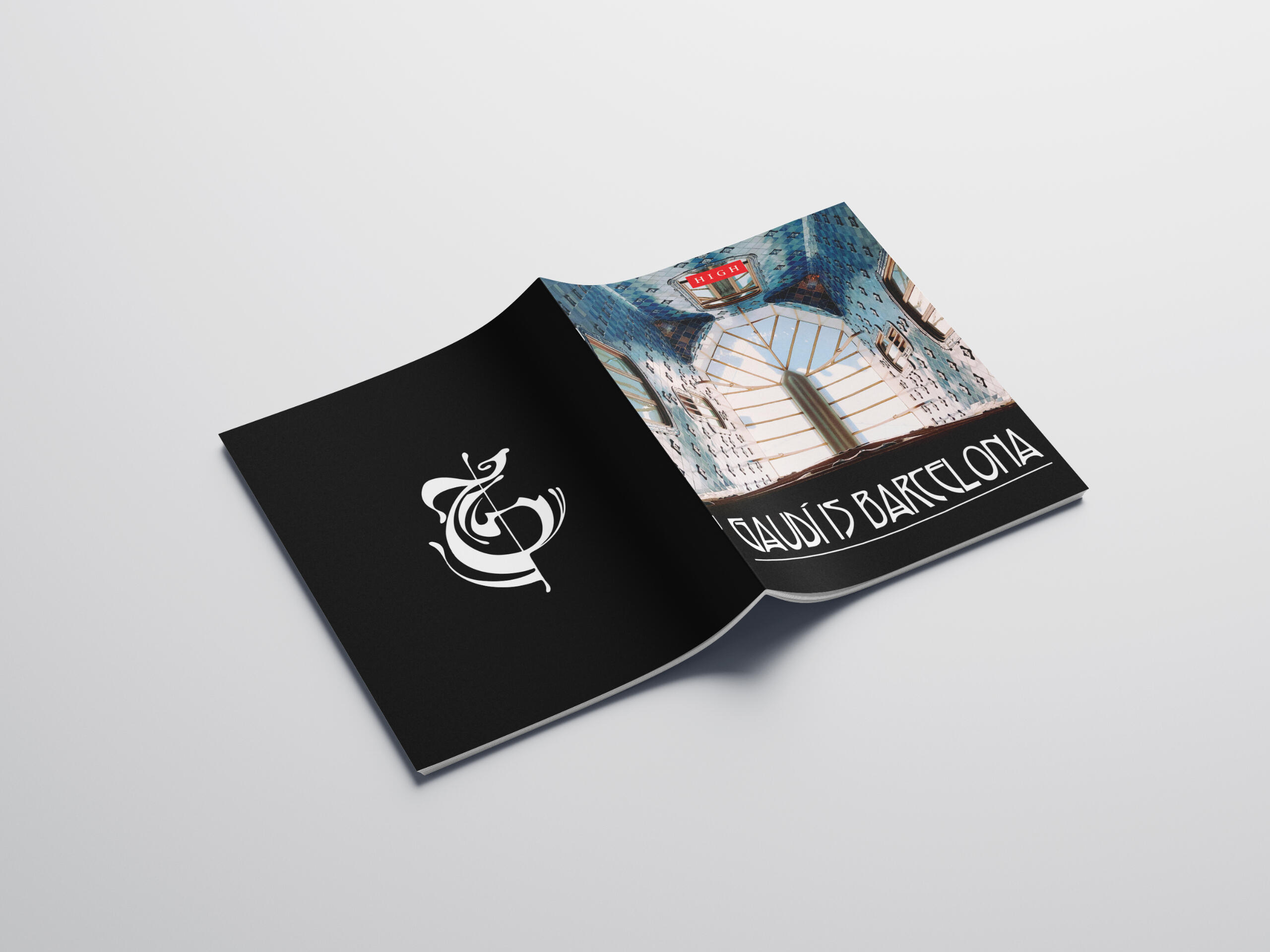
Showcasing Gaudí 's work, a catalog describing the architectural work of his lifelong career was conceived. In alignment with the prestige of the High Museum, minimal, elegant spreads were utilized to exhibit Gaudí's work as the focus. The Art Nouveau-inspired typeface, the adjacent art movement of Gaudí's time, brings out the naturalist envisionings of Gaudí's architecture.


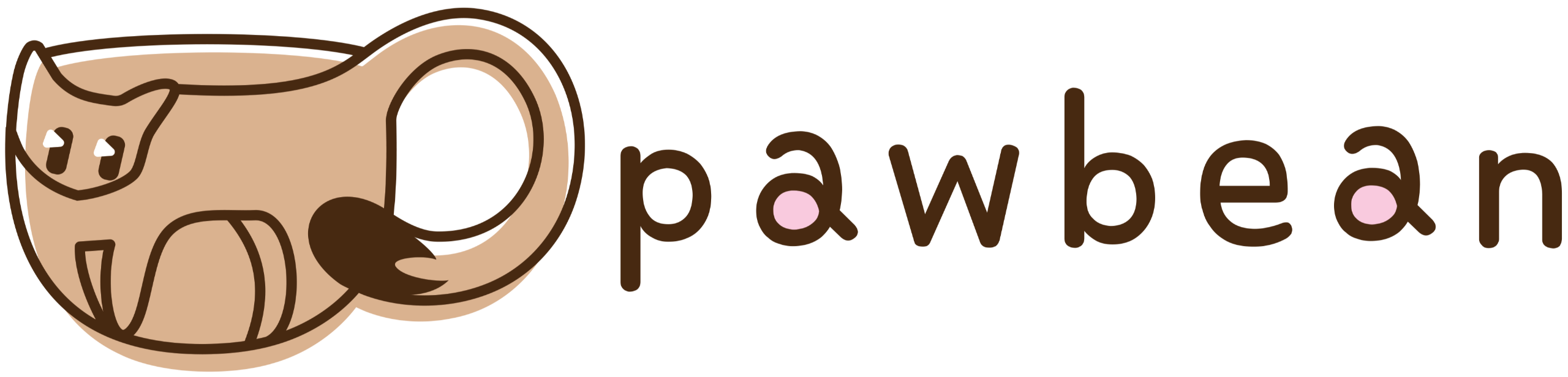
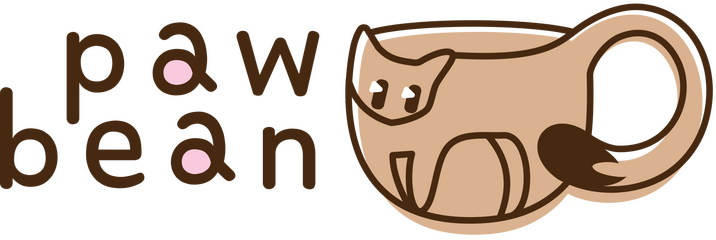
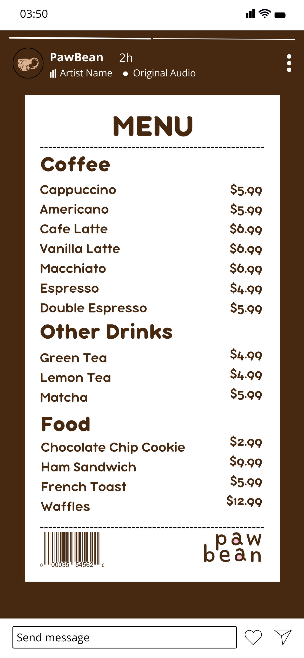
Paw Bean
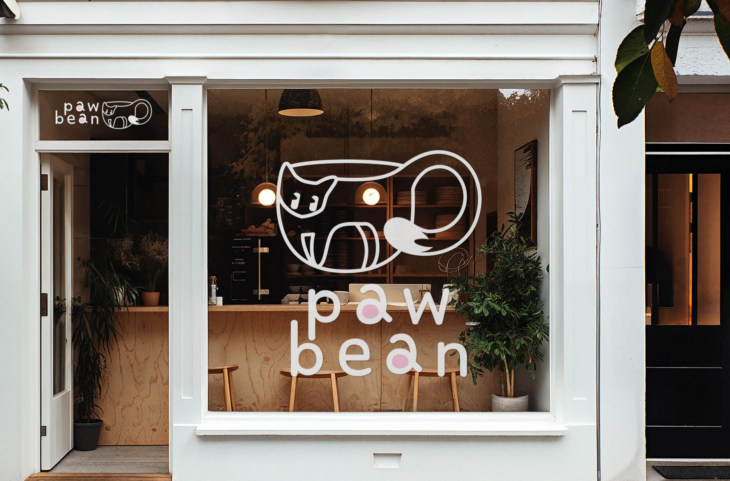
Overview
Paw Bean is a conceptual cafe with a mission to increase the adoption rates of cats by combining the warm ambiance of a bistro with comforting companions to accompany customers whilst they enjoy cappuccinos. To capture the company's mission and culture, a friendly branding package was created with a warm color palette and cuddly logo mark.
Branding
Primary
Secondary
Tertiary


Social Media
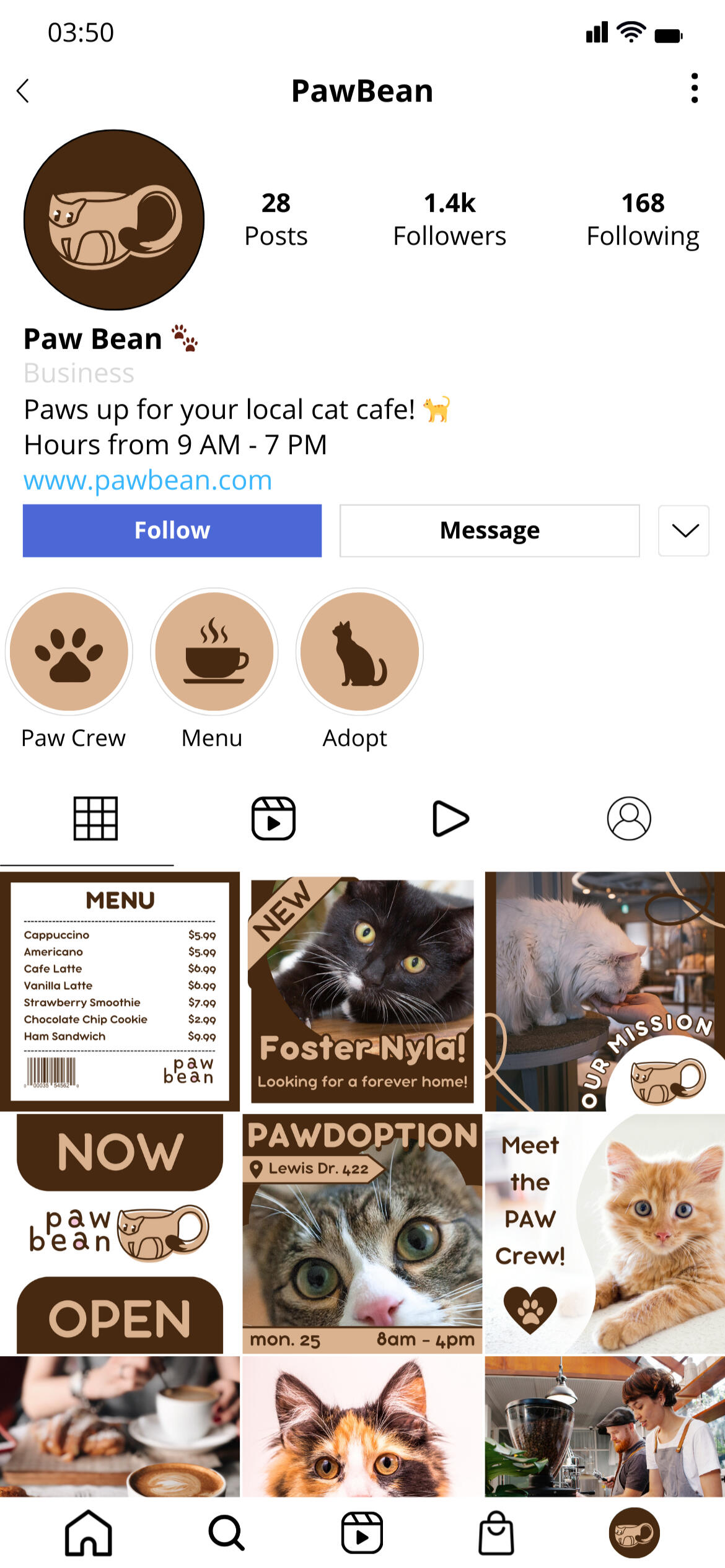
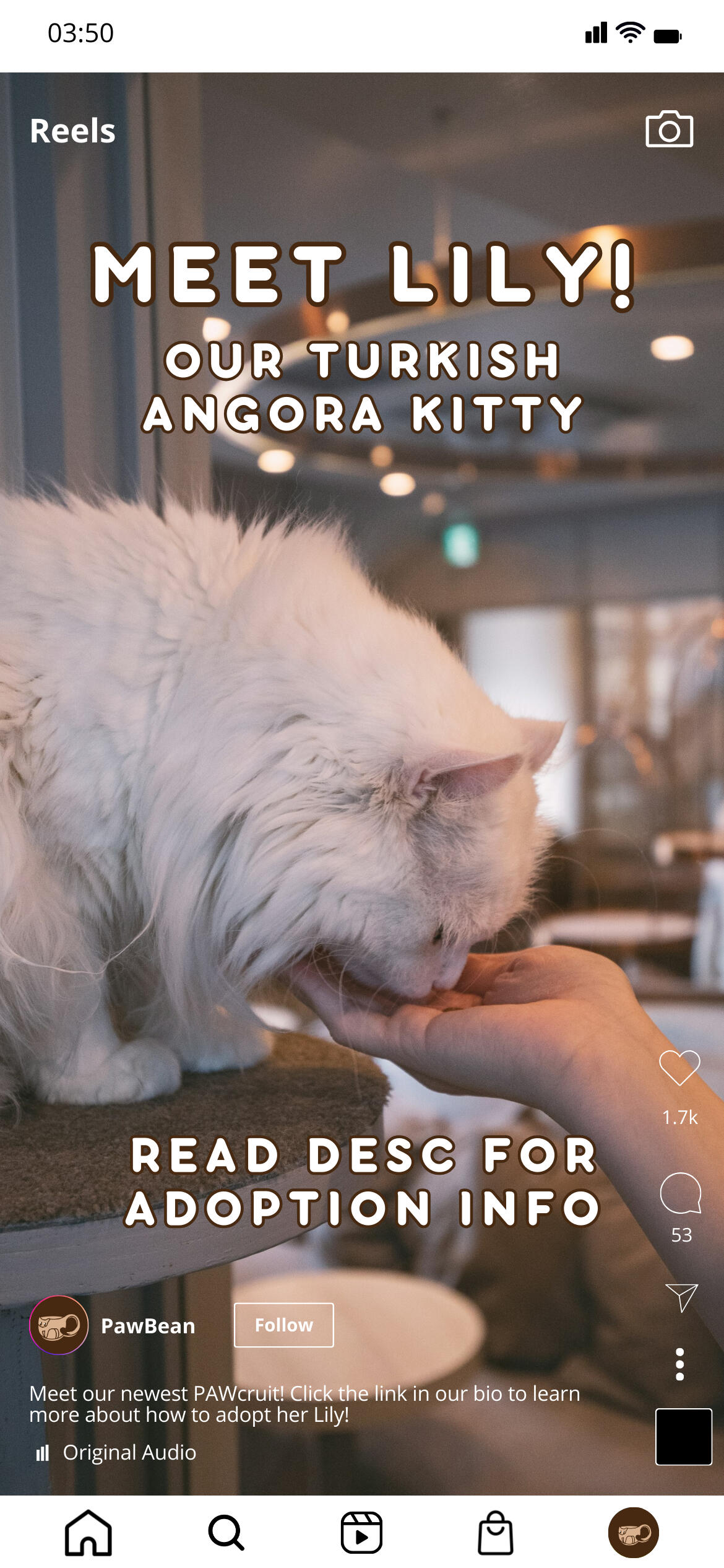
A social media identity was generated from the branding guide, curated to promote the brand's mission and image. Using the soft and dark brown contrast to encourage a hierarchical viewing of the social media page with a high contrast profile picture, eye-catching highlight covers, and color-cohesive posts.
Merchandise
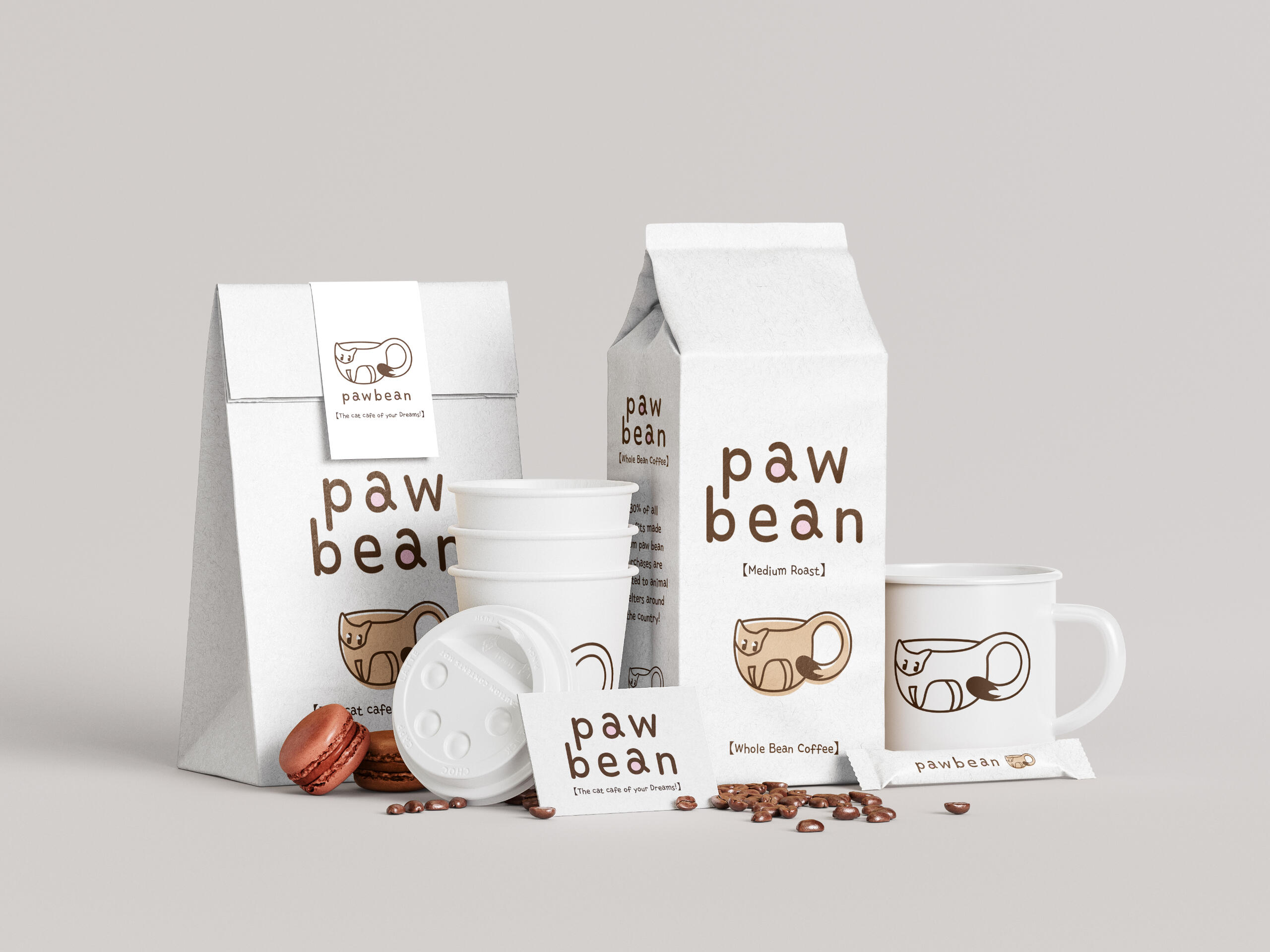
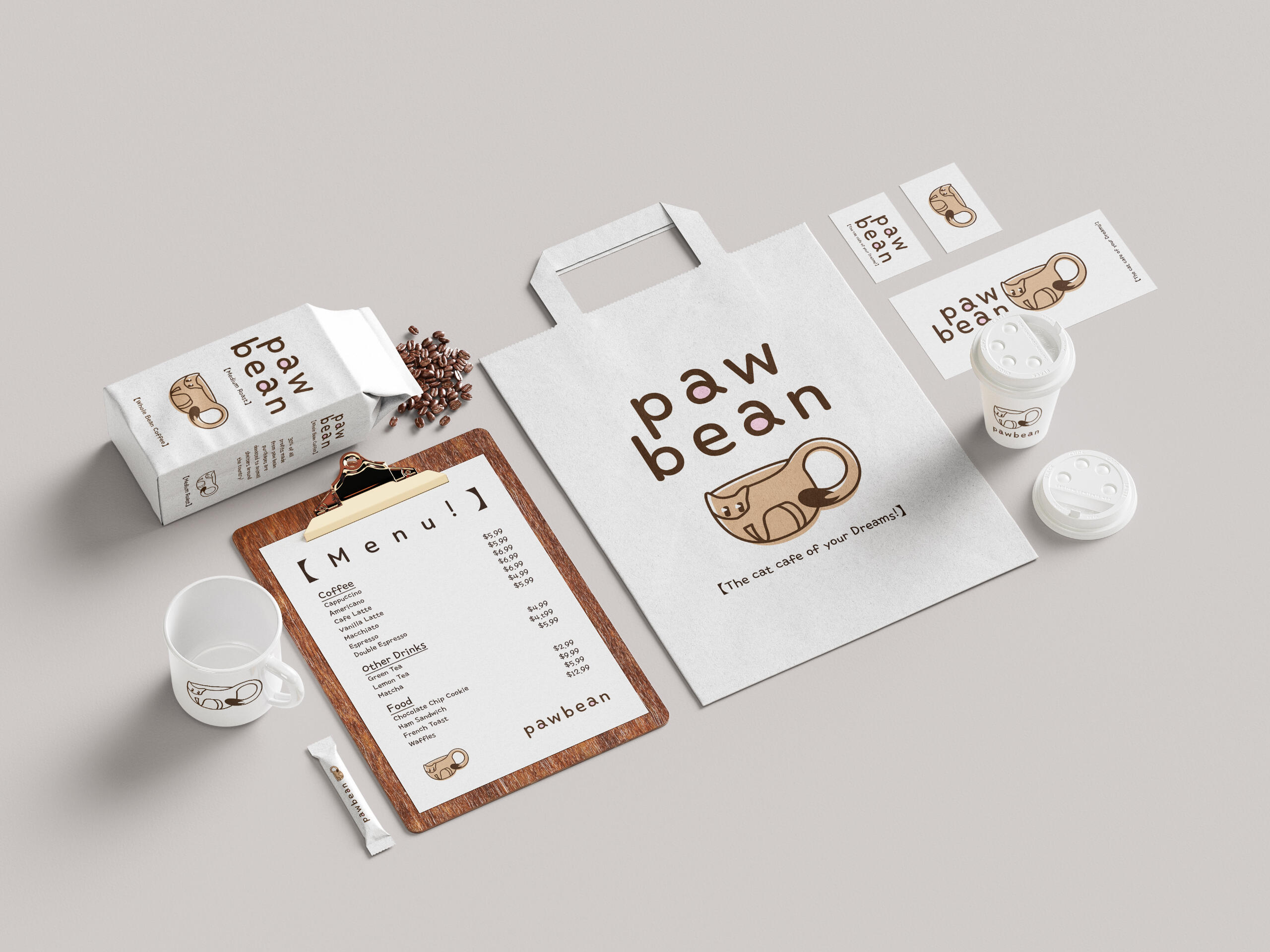
From visual to the physical, the cafe's identity is carried throughout with a soft, palettable design that any pet enthusiast would be drawn to. Clean and concise but with a cuddly side, the extended branding of Paw Bean doesn't just stop at the storefront but carries into their cups, to-go bags, roasted beans, and other various promotional materials. Using white negative space to generate interest in the product with a strong visual hierarchy immediately creates a novelty that capitalizes on the cafe's niche.
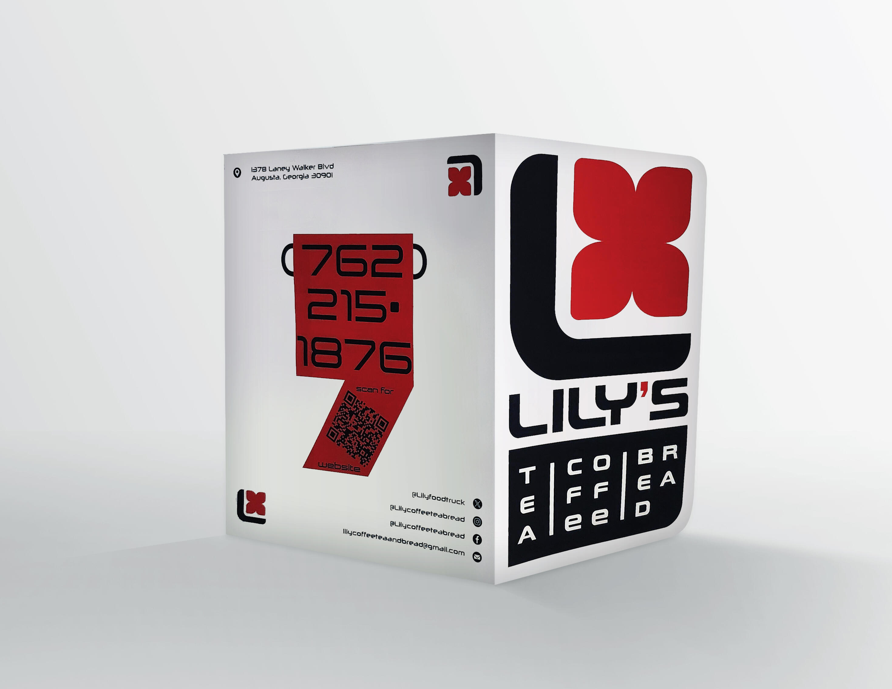
Lily's

Overview
This reimagining of Lily's Coffee Tea & Bread derives inspiration from prominent graphic designer Neville Brody. Incorporating the modern and exciting design with Lily's root imagery and color palette. This new branding follows through on elevating this coffee shop's experience.
Branding


Primary
Secondary
Tertiary
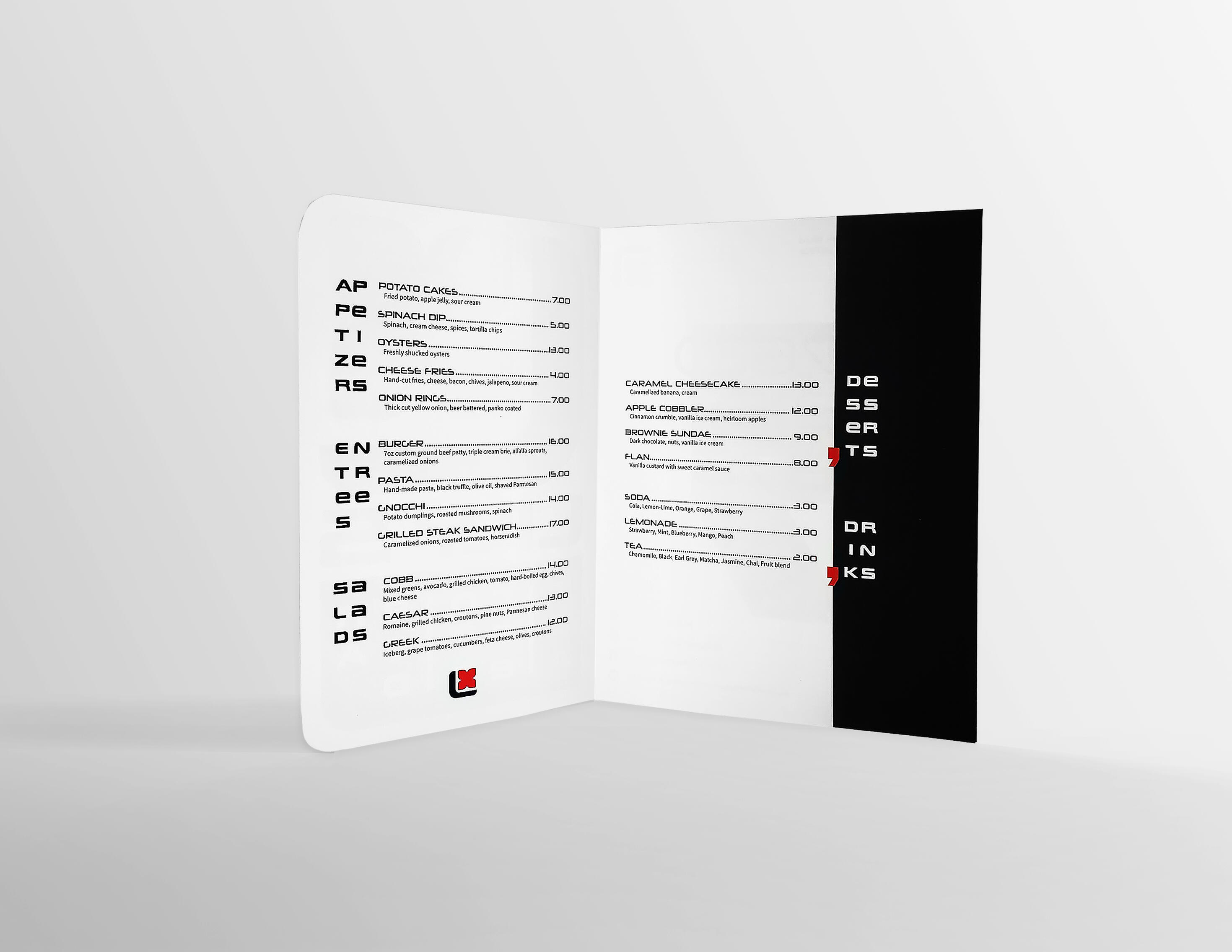
Menu


Bauhaus
Overview
This Bauhaus Presentation pays homage to the famous Bauhaus Movement, characterized by its revolutionary reimagining of what design, in this case, Graphic Design, looks for in the post-industrialized world. The presentation utilizes common design tactics of Bauhaus design with a merging of form and function to create a visually effective presentation.
Design


Thankful 4 America
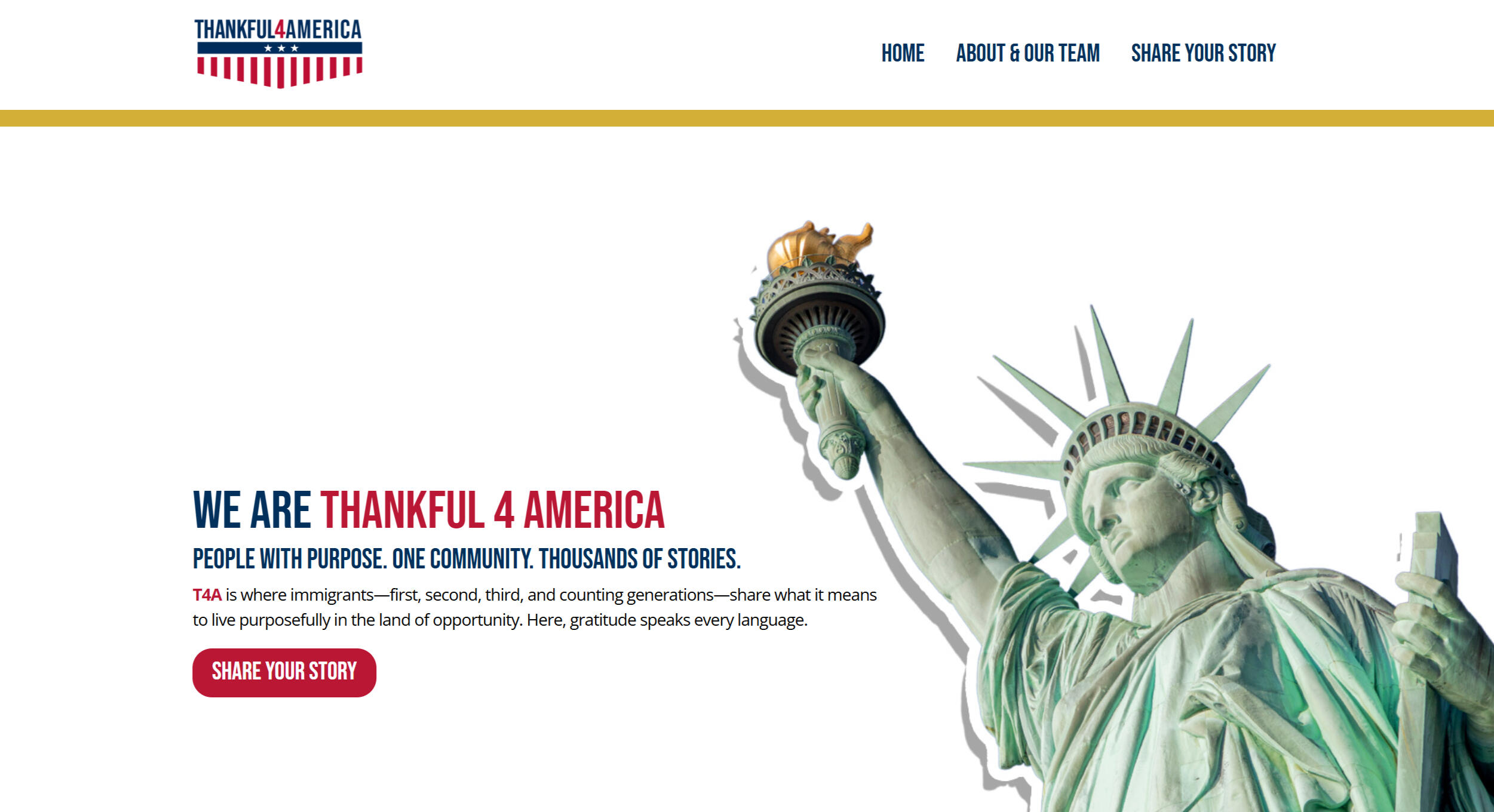
Overview
Thankful 4 America is an initiative that aims to share immigrant stories and the gratitude that comes with the opportunities that flourish under such experiences. To share those stories, a website was created to platform the mission of T4A with a simple yet effective approach to call for immigrants to share their stories.
Design

Utilizing a minimalist and simple approach to website making, T4A stands out with its simplicity. The website language is direct and to the point, with every visual, button, and video showcased.The experience is sleek and minimal, with little friction from passive viewer to active participant. Thankful 4 America's user experience is tied to Thankful 4 America's broader branding guidelines and user needs.


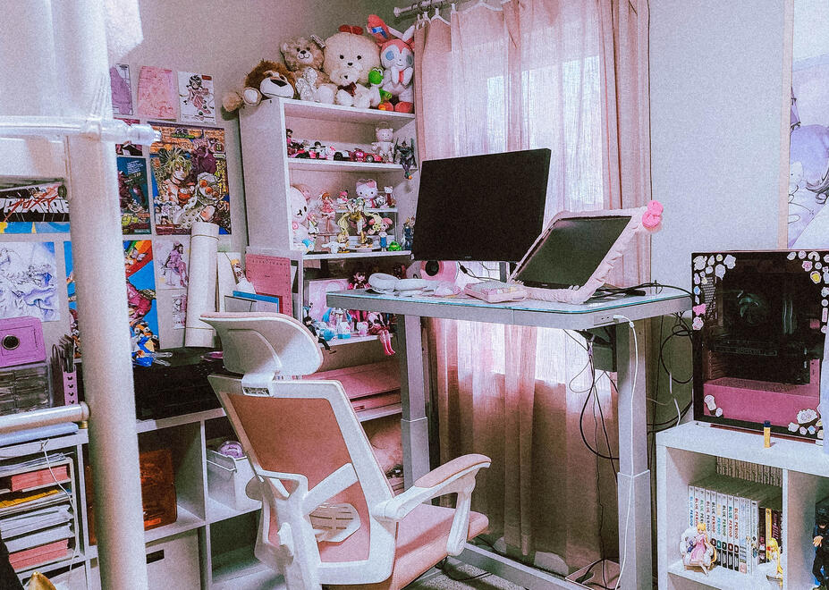
my personal workspace

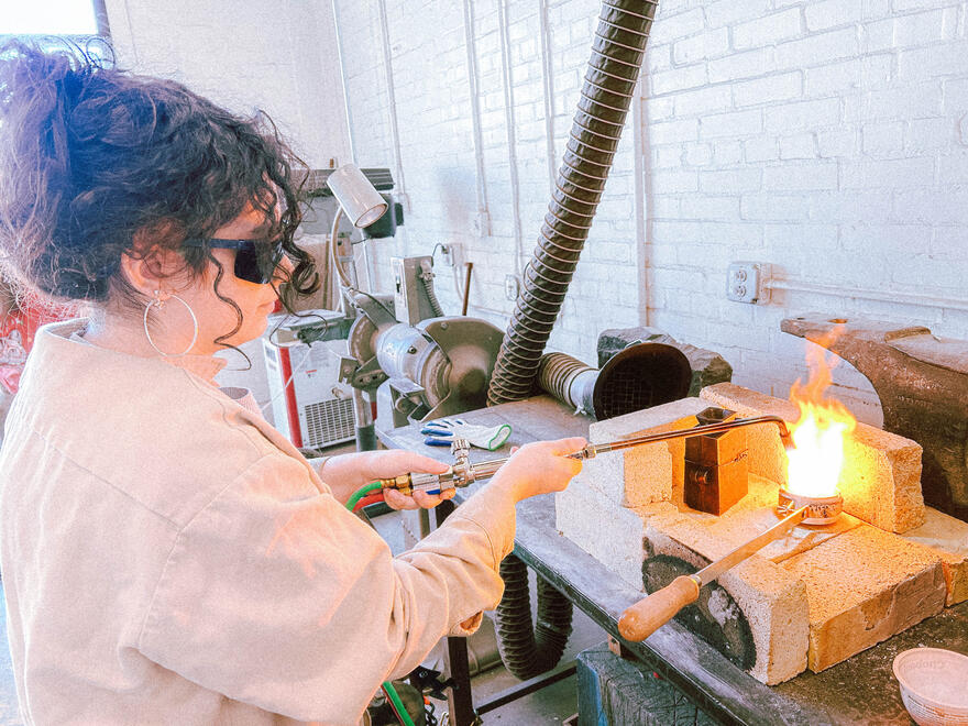
me metal casting
Hiya! I'm Mia,
a Mexican-American graphic designer, born and based in Augusta, GA, and currently on track to complete my B.F.A. in Graphic Design at Augusta University.In my studies and experience, I’ve developed a quite versatile arsenal of skills. I’ve learned what’s needed in comprehensive design projects, from typography and color theory to unexpected skills like casting and CAD modeling. Outside of just technical skills, I’ve also realized an affinity towards the collaborative process, thoroughly enjoying the critique and iteration process of design, rarely finishing a project alone.When I’m not designing, I’m a collector! CDs, Manga, Keychains, or Stationery, my love of all art resonates through my personal style. You’ll know it's me when you hear my bag clanging from all the keychains I’ve put on it! Surrounded and carrying the things that I love is what I do best in my environments.Speaking of environments… I’m currently in search of a fun, vibrant agency to work for! Coupling my skills with a bolstering atmosphere is my ideal outcome.